West End Record Pressing | PORTFOLIO
CLIENT: West End Record Pressing
PROJECT: Visual Identity
ROLE: Brand Design
YEAR: 2021
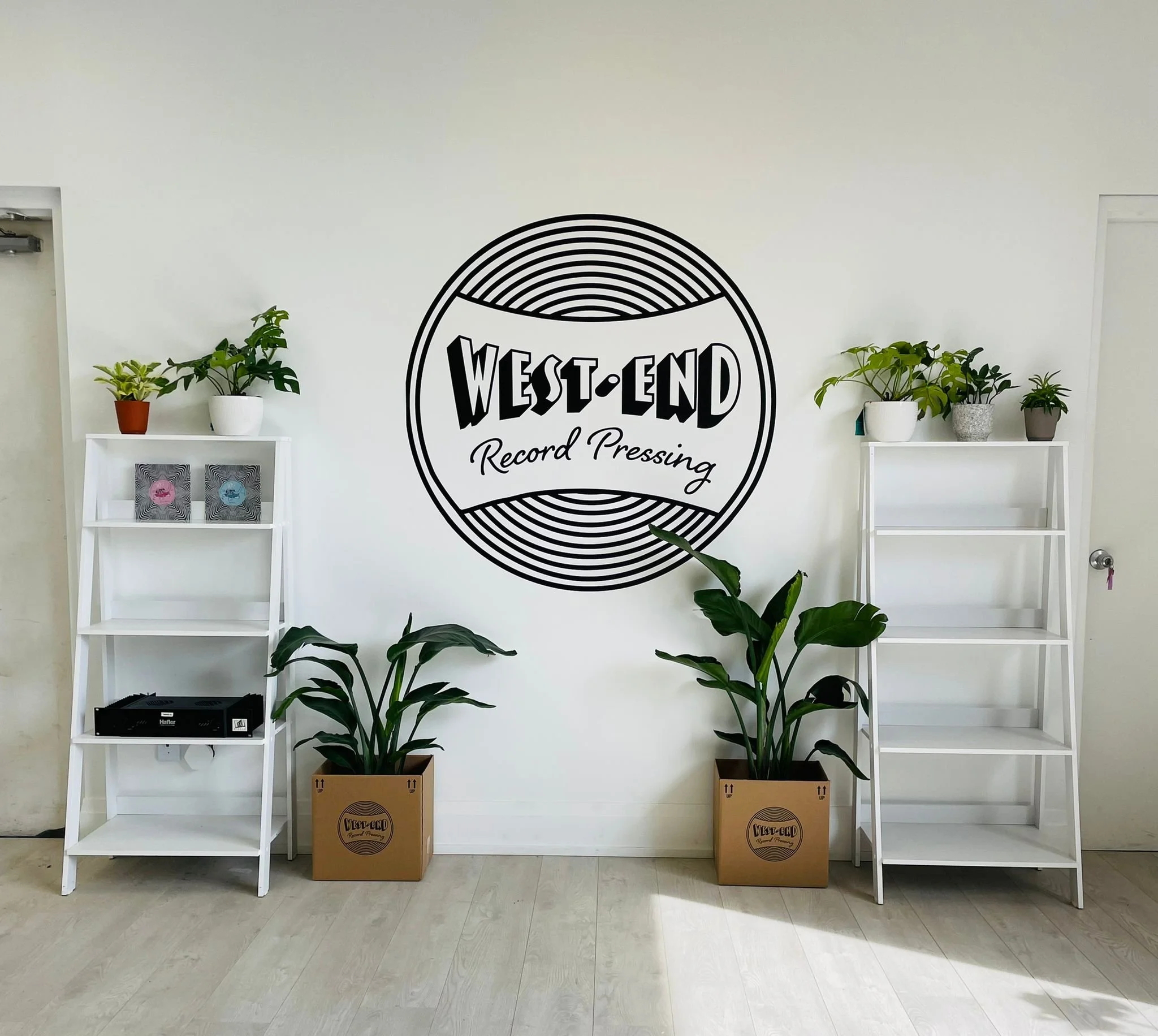
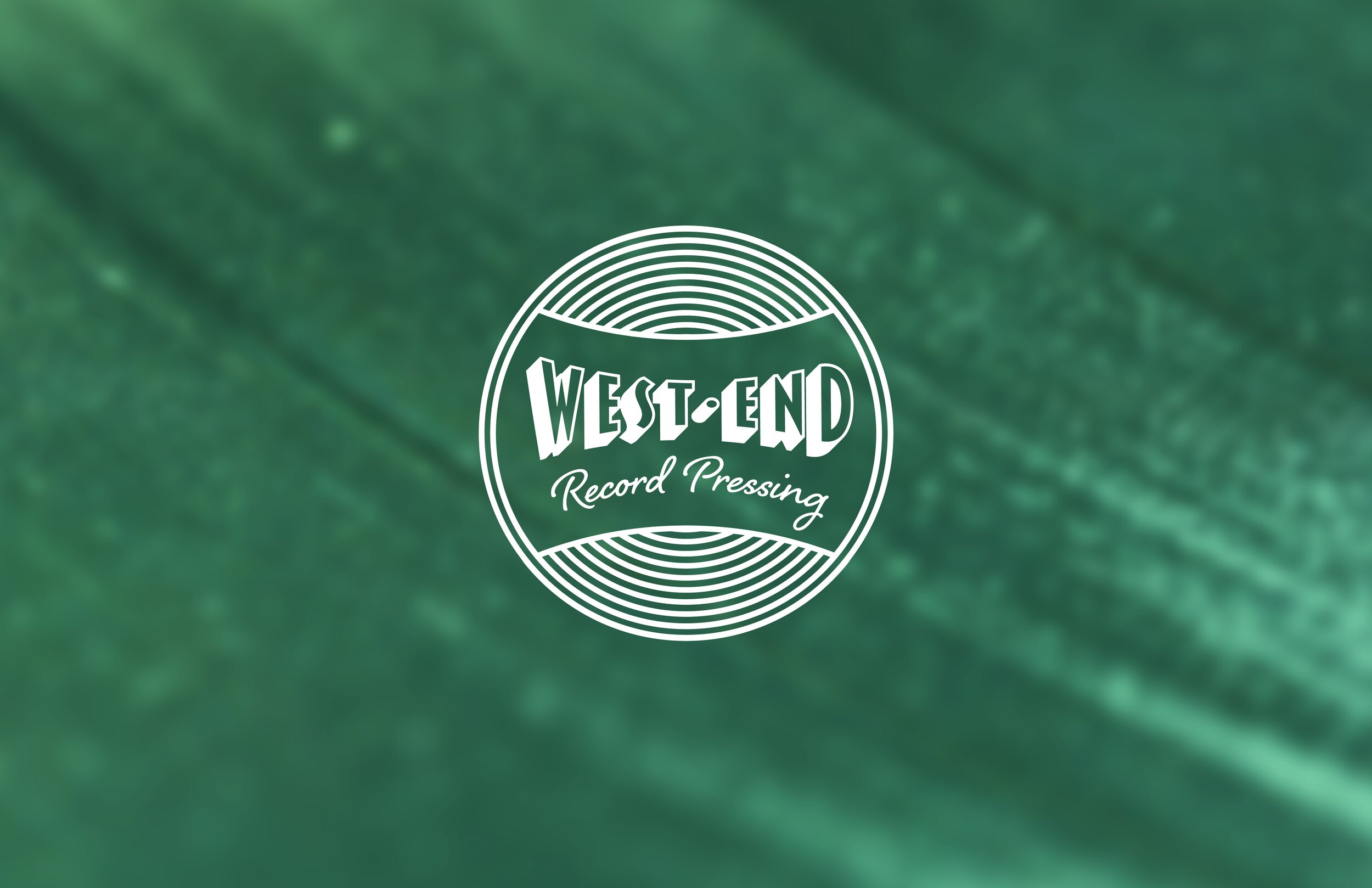
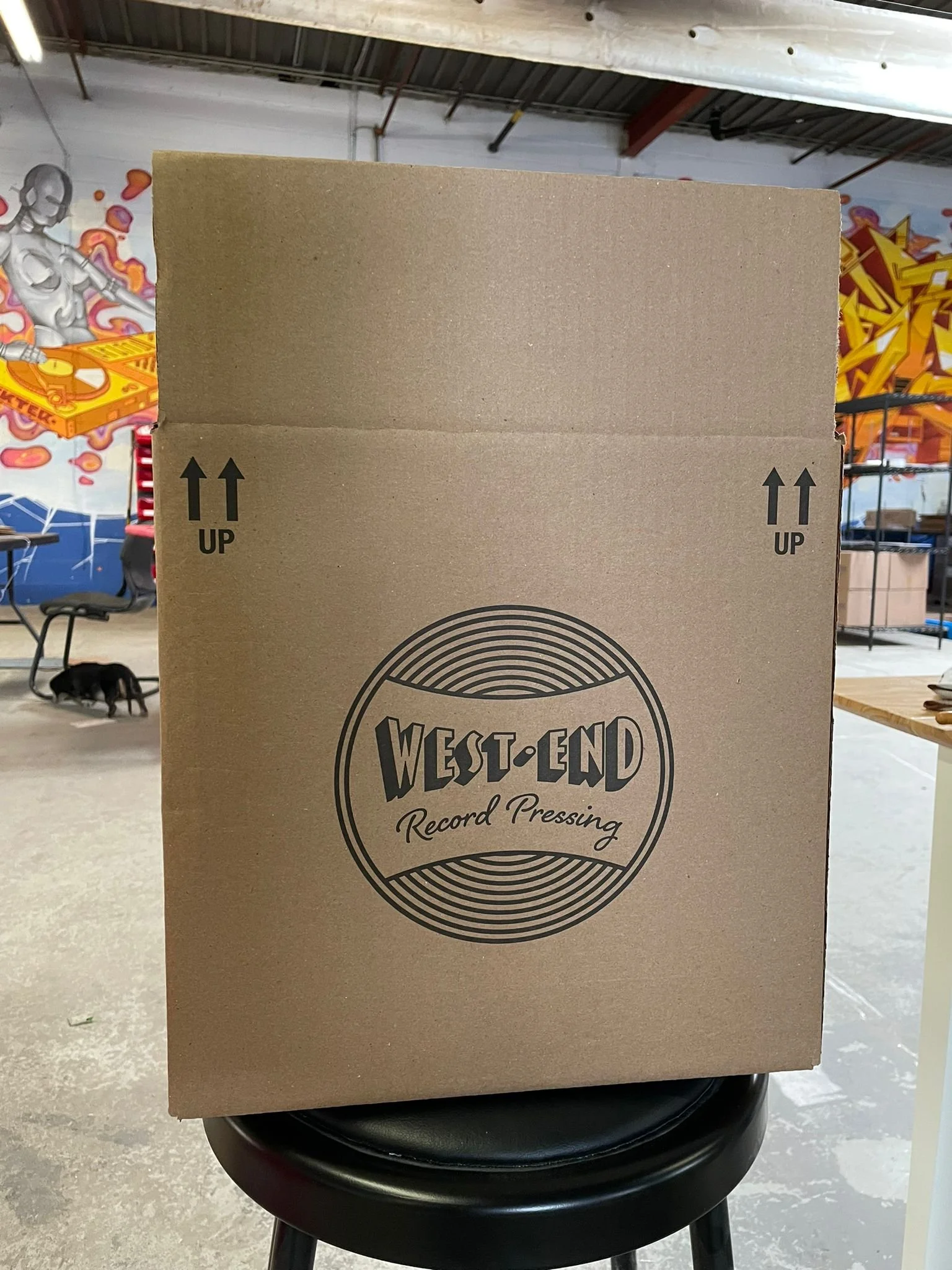
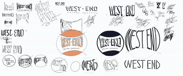
The client was looking for a retro-style wordmark for their new record pressing label.
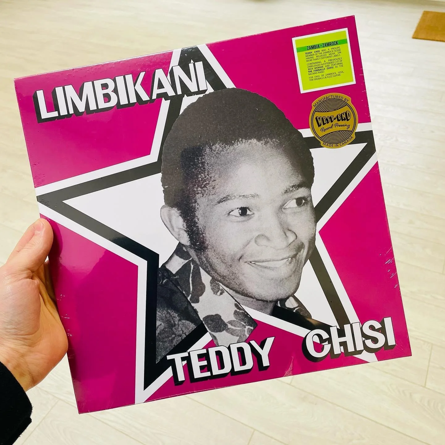
Inspired by vinyl records themselves and old badge-style logos, the circular logo features repeating circles and extruded letterforms that give a sense of depth to the single color mark. The handwritten script font speaks to the small-scale, handcrafted nature of the brand.
Related Projects