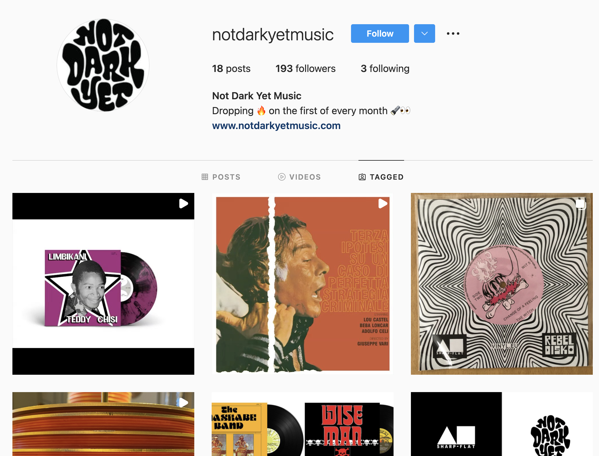
Not Dark Yet | PORTFOLIO
CLIENT: Not Dark Yet Music
PROJECT: Visual Identity
ROLE: Creative Direction, Art Direction, Brand Design
YEAR: 2021
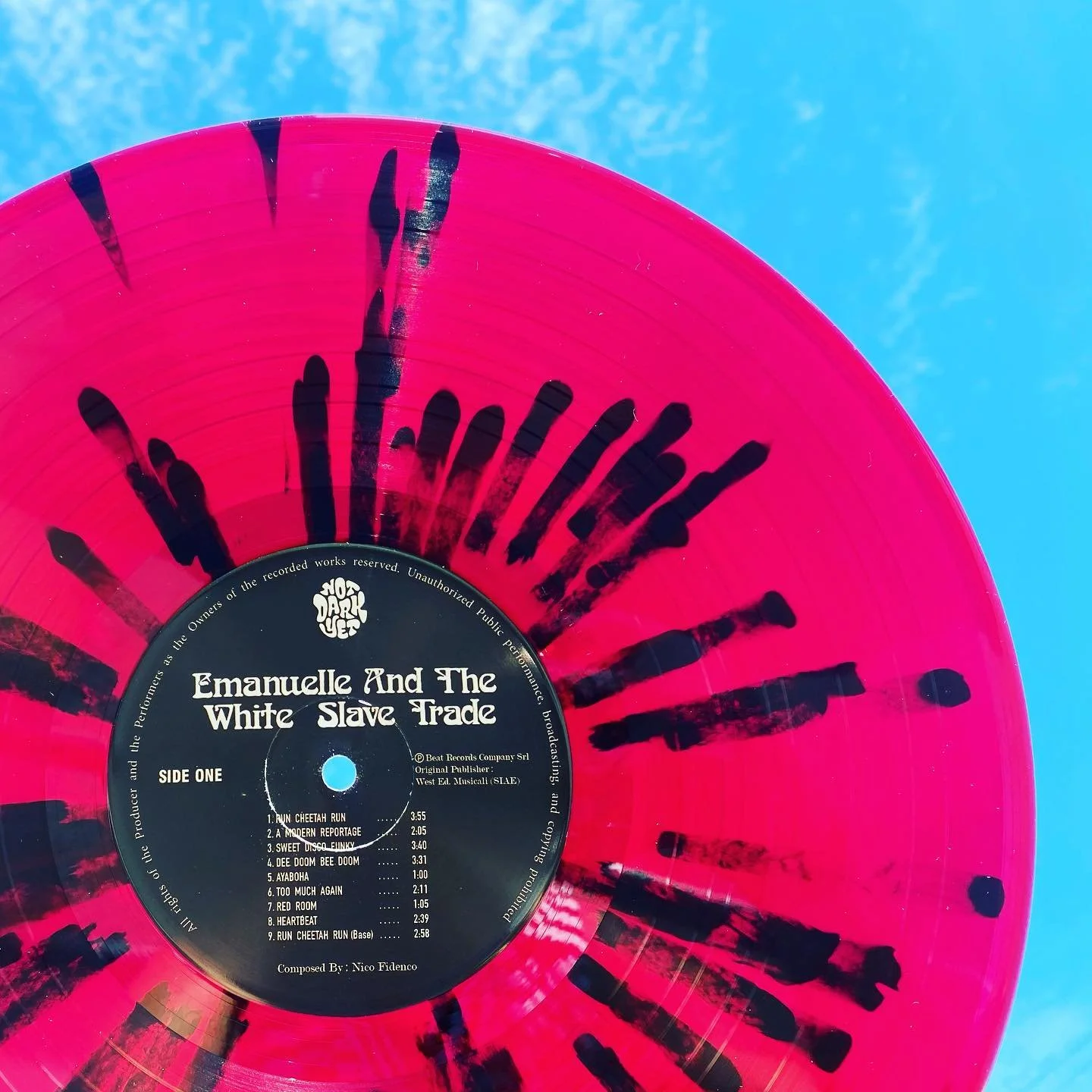
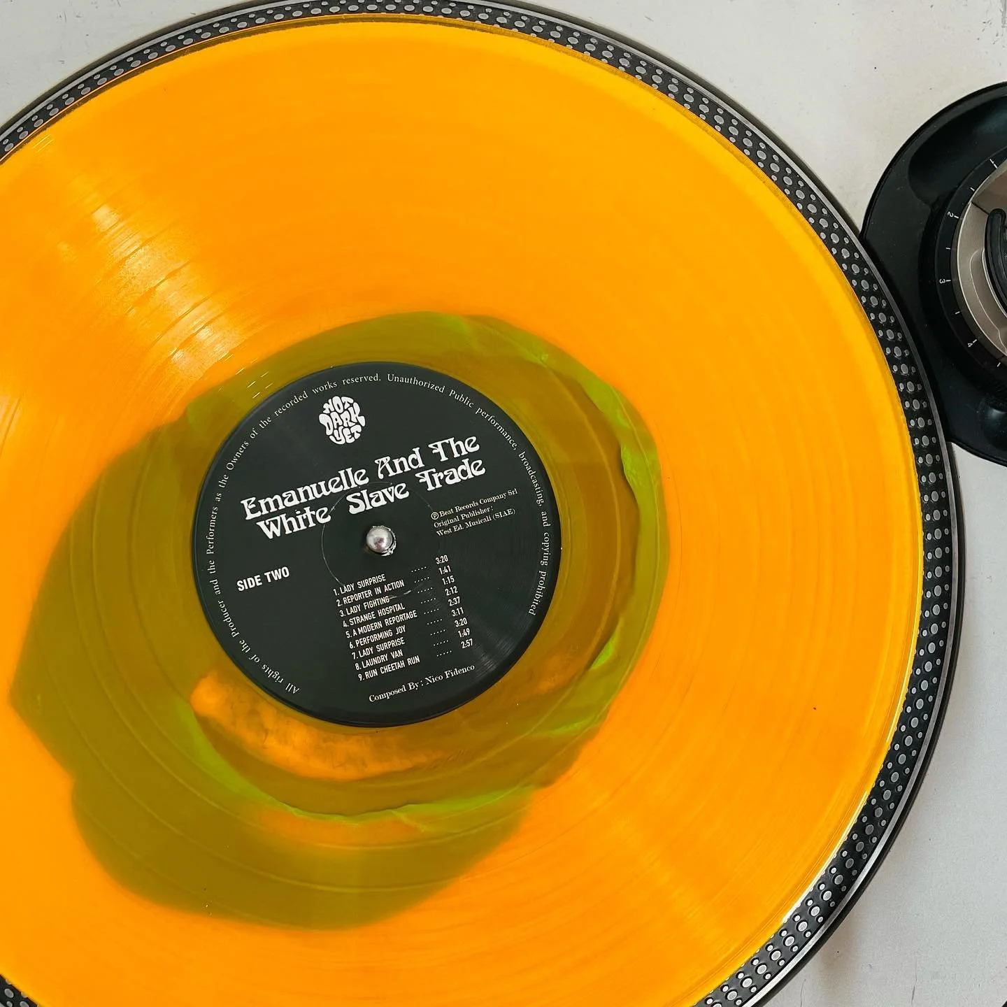
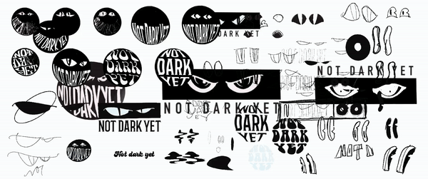
The client was looking for a bold and unique logo that would reflect the careful curation of independent releases that the record pressing label specialized in sourcing, typically a mix of rock, soul, and funk from the 70s. Originally, the client had the idea of incorporating glowing eyes in a dark background somehow, but the concept was feeling too dark and gloomy for the brand.
Through iterative design, several alternative solutions were presented that still embodied the bold and unique qualities of the brand.
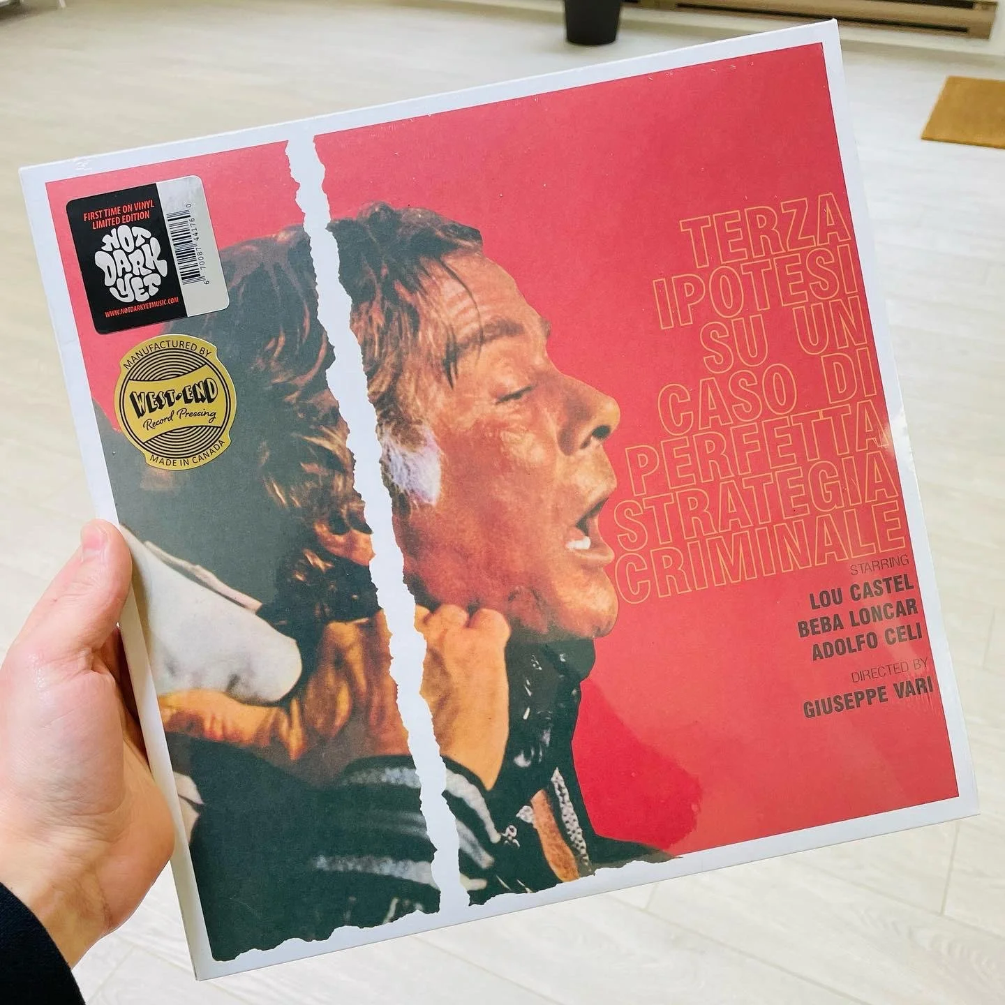
The final circular logo represents to the circular format of vinyl records and features a modified organic bubble font which speaks to the era and genres that most of their releases were originally recorded in.