P&P Roofing | PORTFOLIO
CLIENT: P&P Roofing
PROJECT: Visual Identity
ROLE: Creative Direction, Art Direction, Brand Design
YEAR: 2017
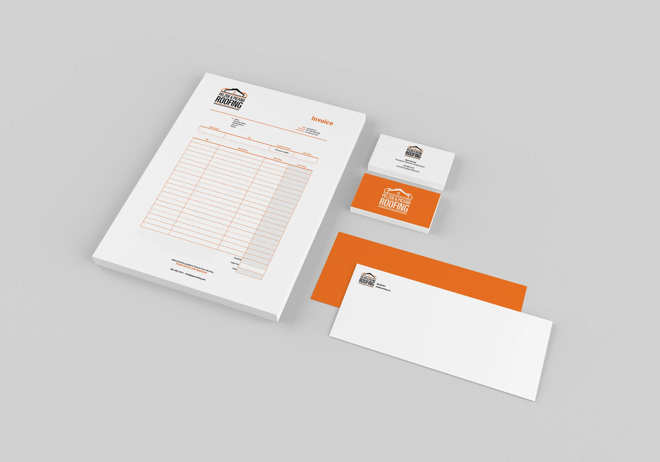
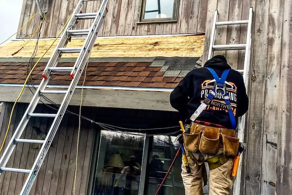
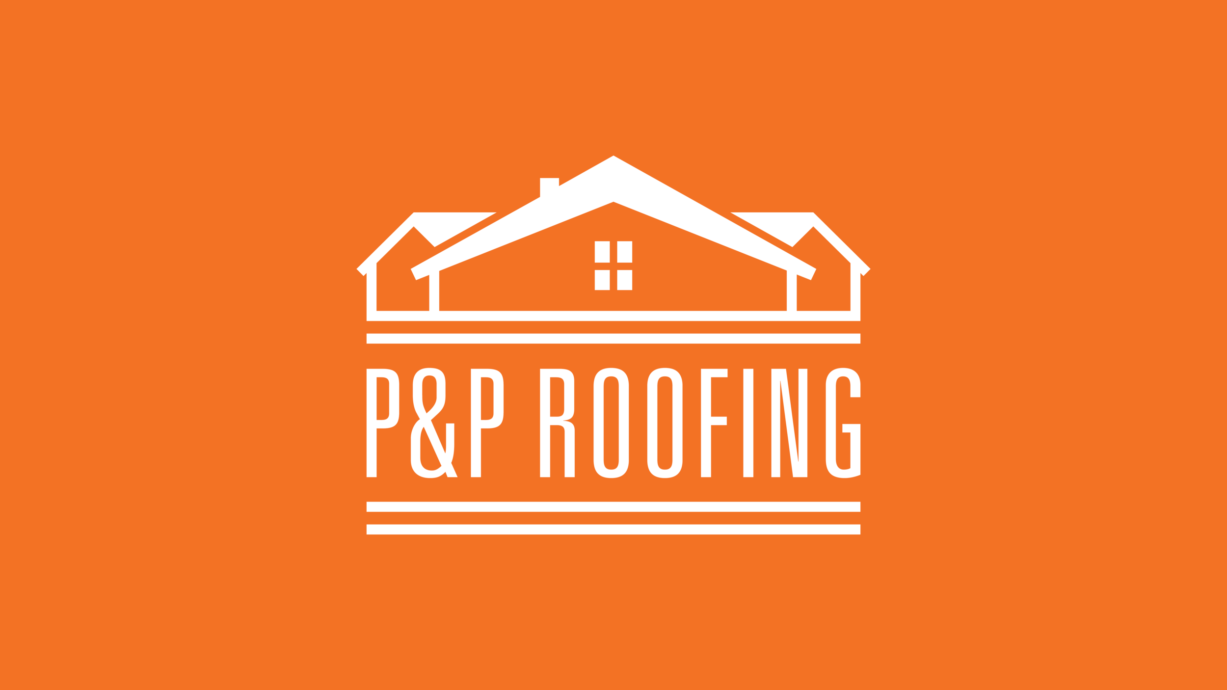
The visual identity developed for P&P Roofing offers a clean and legible logo that marries word and image into one cohesive unit. The client recently launched their new residential roofing business in Halifax area and needed a clean wordmark and visual identity that they could use on company documents, vehicles and workwear. The visual identity needed to have the colour orange incorporated somehow.
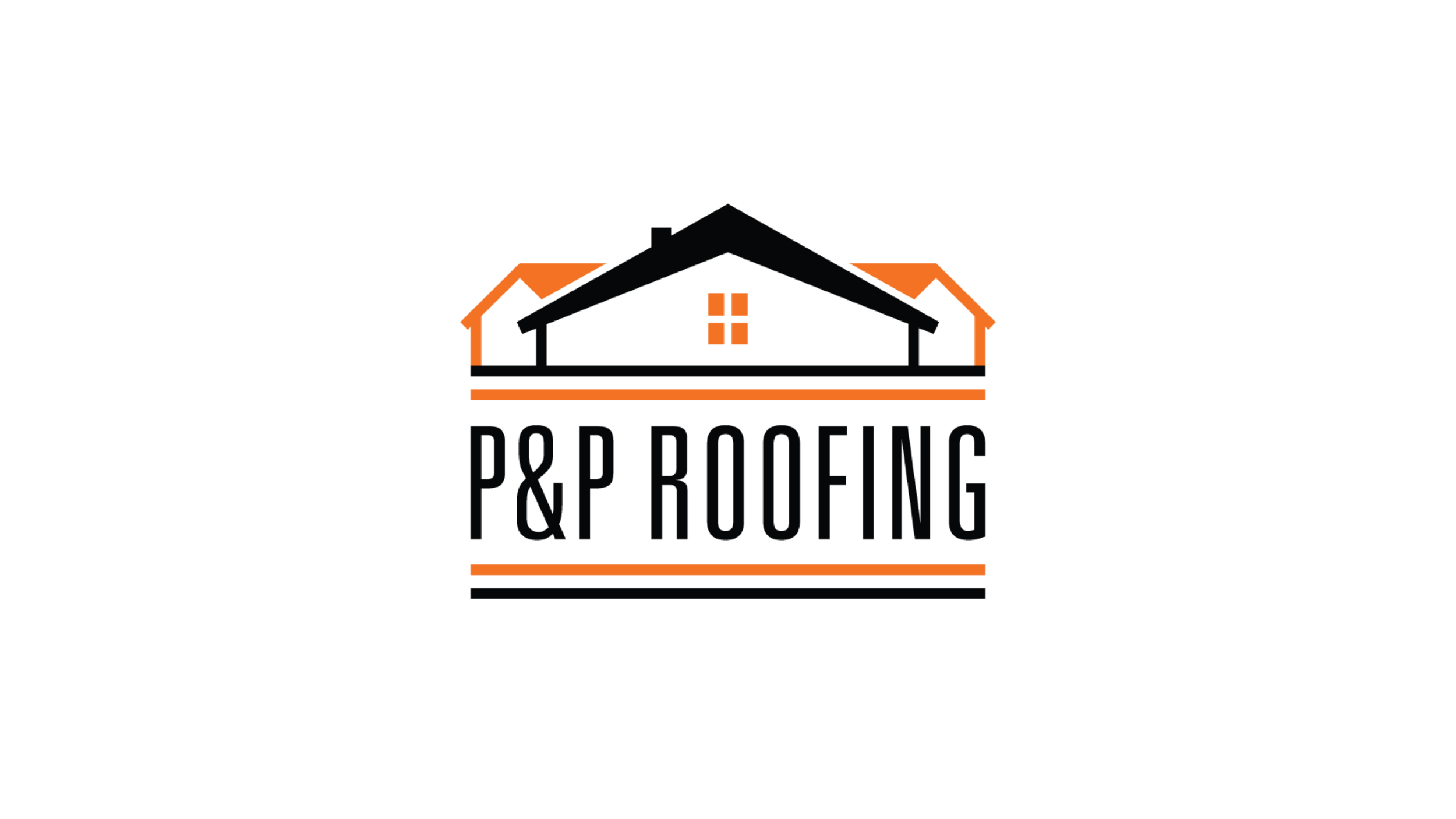
The orange accent colour addresses the importance of safety in all types of roofing, while the angled roofs speak to the residential specialization of the company.

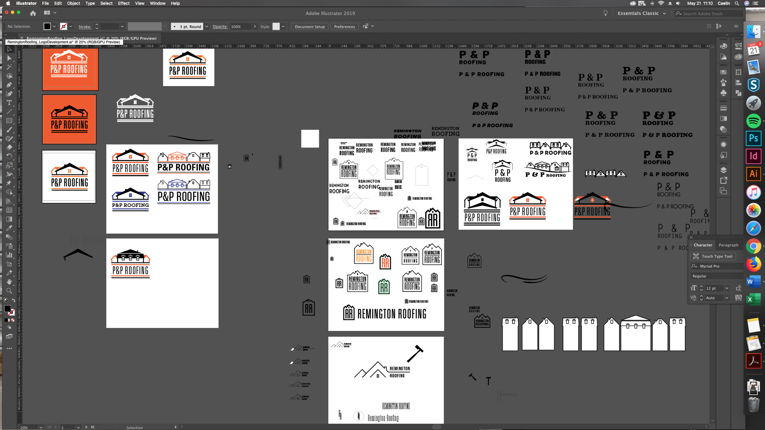
The client provided several reference logos that they really liked already, which helped guide the direction of the final design. A few different concepts were presented for feedback before deciding on the final direction for further refinement.